The Schulz blog has moved!

PLEASE NOTE:

The Schulz blog has moved to a new location and got a new look.
Please update your bookmarks accordingly.

he new url is: http://cartoonstudies.org/schulz/blog/

Cartoonist librarians, Jen Vaughn and Caitlin McGurk.

Sorry for the inconvenience! Please drop by to see the new and improved site.

Thanks!
-Schulz Library crew


S.R. Bissette on Pre-Code Horror Comics Collections: Part 1

Three brand-new books on a long-despised and now fashionable genre—the oxymoronic genre of “horror comics”—have hit bookshops and library shelves over the past month, and CCS’s Schulz Library takes a look at all three this week. All three arrive on the heels of editor/packager/archivist Craig Yoe‘s handsome resurrection of Dick Briefer’s Frankenstein,

  • another slice of Pre-Code horror (and humor) comicbook history we reviewed here last month (in time for Halloween!).
  • It’s been a bountiful harvest for horror comics hounds this fall! Here’s a review of the first—and in many ways, the best—of the crop…

    _________
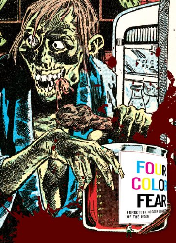
    * Greg Sadowski‘s excellent Four Color Fears: Forgotten Horror Comics of the 1950s (Fantagraphics Books) was the first of a quartet of books on horror comics to surface this fall, and for my money, it’s arguably the most invaluable of the bunch. Graced with an introduction and extensive additional material by vet horror comics scholar, archivist, collector, and expert John Benson, Four Color Fears offers over 300 pages of full-color complete stories lovingly selected from the non-EC Comics Pre-Code horror comics of the early 1950s.

    For reasons clear to anyone with any access to the real Pre-Code horror comics, EC Comics has long dominated any and all books about the genre and the 1951-1954 boom years in particular. But there was plenty of other outstanding, outrageous, exciting, and just plain bizarre material published in that fleeting but jam-packed three-year period, and it’s high time we saw some of that work disintered and shared. While collectors have rescued and savored much of this work, it’s been nigh on impossible for non-collectors (including scholars and serious researchers) to access the non-EC Pre-Code horrors.
    There are forty—count ’em, 40!—vintage horror comics stories showcased in this glorious collection. They are all reproduced from their original four-color printings, preserving the instrinsic flavor (and trash aesthetic) of the era and form, along with a handsome cover gallery insert (printed on slick paper) and abundant, informative, heavily illustrated notes on all the stories and what is known of their creators. This section of annotations also offers more delicious cover art, along with much previously unavailable information on the who, what, when, and how of the comics and creators themselves.

    There are some real revelations here, and I can tell you that this hardcore horror comics scholar/collector/creator is eternally grateful for all that Sadowski and Benson have added herein to a richer knowledge of these unique comics and this grossly misrepresented and misunderstood period in comics history.
    With an eye toward entertaining fully as well as curating, Sadowski’s greatest accomplishment here is making Four Color Fear such a fun and engaging read, cover-to-cover. Stories, and their order, have been chosen and orchestrated for optimum effect for casual reading, in the order presented. Let me tell you from hard experience (my years editing new horror comics stories in Taboo, 1988-93), that this is far easier said than done; in a genre grounded in provoking negative emotions for its primary effects (i.e., fear, dread, disgust, horror), it’s a real tightwire act to determine which stories belong where, and what effects are created by where an editor places a particular story, idea, or image. A misstep can either make or break a story, ending, or key moment, and careful orchestration of humor, horror, and variety is essential to making this sort of thing sing.

    In this, Sadowsky brings far more care to his anthology than any of the original editors of these comics seemed to; the cumulative effect, at times, is intoxicating, and the ways in which both the individual art styles and the narrative content are woven into a satisfying tapestry are often witty, sly and insidious. There’s a lot of smart work, here, and as a result it’s a super read for everyone, whether you’ve never before sampled this era’s strange fruit or are (like me) a long-time fan and collector.

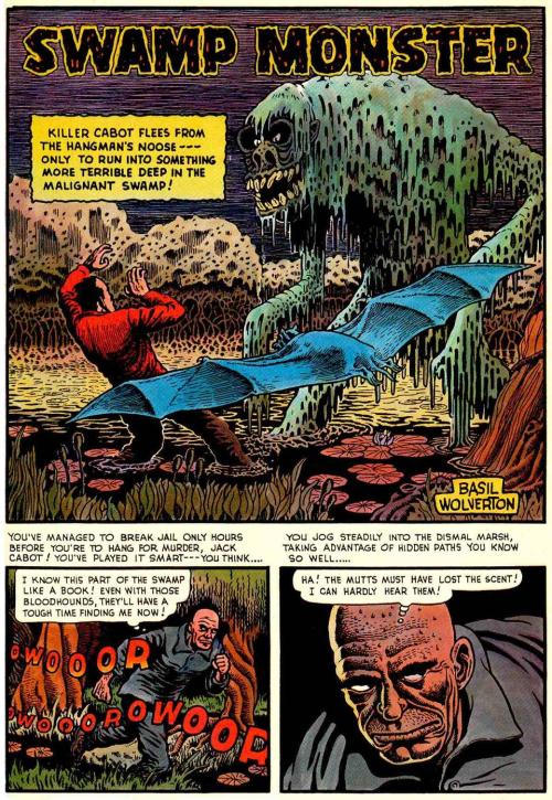
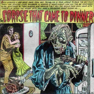
    It’s gratifying to find a few of my all-time favorite stories and artists here (like Basil Wolverton‘s “Swamp Monster” from Weird Mysteries #5, June 1953, pictured above, left; and Reed Crandall‘s “The Corpse That Came to Dinner” from Out of the Shadows #9, July 1953, above, right). It’s even more gratifying to find so many surprises and—in the fresh context of Four Color Fear—stories I’d long ago read and shrugged off so revitalized by what Sadowski places them between and/or alongside here.
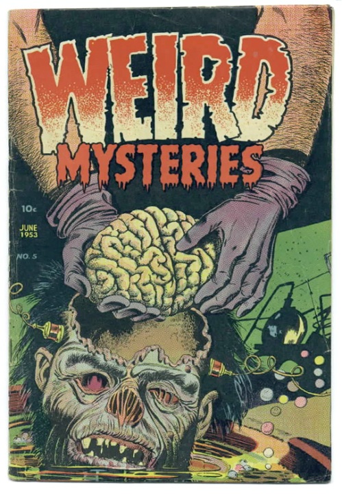
    [A notorious Bernard Bailey cover for Weird Mysteries #5 (June 1953) that I’ve always included in my own lectures on the Pre-Code horror comics, and that is featured in both Four Color Fear and The Horror! The Horror!; a small taste of how extreme the Pre-Code horrors could be and often were.]

    ___

    Caveats: Aside from quibbling with some of Sadowski’s selections, which I won’t do here (see “addendum & full disclosure” note at the end of this post; I have plenty of my own personal favorite Pre-Code horrors, and if anyone’s interested, I’d be happy to talk to an agent, editor, or published about putting together such a volume), a fuller working knowledge of the horror genre in all media would have lent even more weight and insight to this collection. While it may seem like hair-splitting to criticize such an incredibly generous tome, genre studies and horror genre academia in particular has been thriving, and the ways in which Pre-Code horror comics in particular both “borrowed” (often blatantly ripped-off) from all that came before, and anticipated much of what was to follow, is an aspect of the genre’s evolution in all media that has been lazily cited for decades but rarely, almost never, really brought to light. This was a stellar opportunity to do so, but Sadowsky and Benson keep their focus on the context of comic book history alone, which is occasionally a frustration for this reader.
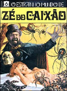
    The ways in which particular comics stories appearing here stole from their precursors—in gothic, pulp, and radio genre fiction, as well as popular writers of their era—is mentioned, but rarely specifically cited. In other cases, a knowledge of past and future genre landmarks would have lent some heft to the legacy under scrutiny: for instance, a sample of how Matt Fox‘s Pre-Code comics covers reworked his venerable Weird Tales pulp covers would have been welcome. Mentioning the uncanny parallel between the Iger Studio “Experiment in Terror” (from Haunted Thrills #13, January 1954) and the final episode (“Theory”) in José Mojica Marins‘s notorious horror portmanteau film O Estranho Mundo de Zé do Caixão/Strange World of Coffin Joe /The Strange World of Ze do Caixao (1968) would have added resonance to the whole (in fact, Marins’s “Theory” is almost identical to “Experiment in Terror” in many particulars, right down to the philosophical intent of the madman staging the grueling ordeal; that Marins also spawned his own Brazilian horror comics only intensifies the associative links begging to be drawn here). Instead, we’re treated to another Jerry Iger anecdote that has nothing to do with the story itself (though it’s neat to see the connection made—in a caption—between the story and its apparently intended cover art, which instead was published eight months later on another title, Fantastic Fears #9).

    Sadly, it must be noted that the cover is the book’s greatest liability. Any one of the actual Pre-Code covers in the gallery would have done a better job of properly promoting and packaging the contents. I see what the designer was trying to do (conceptually a clever fusion of images from the Reed Crandall splash for “The Corpse That Came to Dinner” and page 4 of Howard Nostrand’s art for “I, Vampire,” from Chamber of Chills #24, July 1954, reprinted on pp. 209-213), but graphically it’s a failure and easily lost on both the book store shelves and online venues. The book’s title is lost, too, and the addition of a fancy varnish-printed blood splatter design (front and back) only further complicates the design. Again, I get the intention and concept, but… sigh. As with the otherwise definitive Fantagraphics Book on the late, great underground (horror) cartoonist Greg Irons, You Call This Art?!!: A Greg Irons Retrospective by Patrick Rosenkranz (2006), what should have been an easy-sell given the incredible imagery associated with the chosen subject has been compromised by a cover that simply confuses and/or repels the eye (and not in the way horror comics intend to repel). Here’s hoping either future editions or future collections from Fantagraphics better serve the genre and their own product.

    In all other departments, this is a terrific book, and highly recommended.
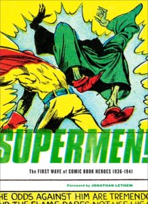
    This is a marvelous companion to Sadowski’s earlier Fantagraphics collection Supermen! The First Wave of Comic Book Heroes 1936-1941 (2009), in which Sadowski similarly shed light on too-long-forgotten gems, curios, and entertainments from comics creators and publishers that have been essentially ignored and/or disposed of by the forces that shape comics history. As in Supermen!, Sadowski’s appetites and reach prove satisfyingly diverse, all-encompassing, and yet quite selective— without catering to traditional, constrictive standards of “taste.” Sadowski knows that some of the most outrageous, insane, and appalling vintage comics stories and imagery are also among the most fascinating; and nowhere is this truer than in the horror comics of the Pre-Code boom years. Four Color Fear also whets this reader’s appetite further for Sadowski’s forthcoming Setting the Standard: Alex Toth (announced for spring 2011 publication).
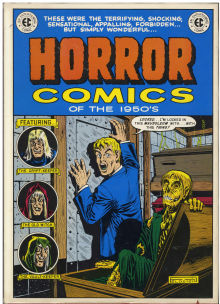
    While much work that was hacked out by impoverished creators working for opportunistic packagers and publishers paying chicken scratch rates has justifiably been neglected, both Sadowski and Benson make a strong case for preserving and reprinting the cream of such publishing backwash, and Four Color Fears is a welcome remedy and companion to the handsome EC Comics reprint volumes (many of which Benson contributed to or packaged himself) that have been available since Nostalgia Press‘s historic Horror Comics of the 1950s (1971, edited by Ron Barlow and Bhob Stewart) enshrined EC Comics as the peak product of the Pre-Code horror publishers. Ever since, EC’s horror comics have almost exclusively dominated any published reprint editions of the genre’s fertile Pre-Code explosion.

    Given the high quality of the EC line, that’s been completely understandable, but now that the entire EC line has been repeatedly (and beautifully) reprinted, republished, repackaged, and immortalized ad infinitum, it’s high time the other Horror Comics of the 1950s were allowed to rise from the dead.

    That classic 1971 book was a beautiful start; four decades later, Sadowski and Benson have at last graced us with a worthy followup.

    – S.R. Bissette, Mountains of Madness, VT

    __________________

    Addendum & full disclosure: Having been one of the active creative collaborators (I was the penciler) on DC Comics’s Saga of the Swamp Thing when that title was rejected by the Comics Code Authority (with SOTST #29, cover dated October 1984)—which was the wellspring for the entire Vertigo Comics line—I’ve had first-hand experience with (a) the Comics Code’s policies and (b) horror comics bucking the CCA. FYI, we did not change anything in the issue; it was sold without the CCA Seal; sales went up; after two more issues, we no longer had to submit to the restrictions of the CCA. Though I repeatedly asked for a copy of the extant CCA Code itself during that (brief) debacle, none was provided, and it seemed despite the fact that DC honcho (and my former Kubert School instructor) Dick Giordano was DC’s rep on the CCA, nobody at DC Comics actually had a copy of the then-extant CCA Code to send me.

    Finding this perverse process fascinating, and loving horror comics anyway, I spent much of the next five years researching and collecting Pre-Code horror comics. The fruits of that research and collection became my traveling slide lecture “Journeys Into Fear,” which I debuted as a one-hour talk at Necon (an annual July gathering of horror writers that I attended faithfully from the late 1980s until 1999, and which I sorely miss being part of) in the summer of 1988 or ’89. I expanded the lecture into a two-hour-plus illustrated presentation that was eventually presented in over 60 venues throughout the 1990s in the U.S. and abroad, often as fund-raising events for the Comic Book Legal Defense Fund. Along with presenting the lecture (at my own expense) as a CBLDF fundraiser during the mid-1990s Spirit of Independence tours, these venues included the Copenhagen Comic Art Library in Copenhagen, Denmark; The University of Connecticut, Storrs, Connecticut; Utica College, Utica, New York; Duquesne University, Pittsburgh, Pennsylvania; the 2nd and 3rd Annual World Horror Conventions; the San Diego Comics Convention; Marlboro College, Marlboro, VT; Bennington College, Bennington, VT; Henderson State University, Arkadelphia, Arkansas; FantAsia Film Festival, Montreal, Quebec, Canada; and many others. In 1999, “Journeys Into Fear” was expanded into a one-week seminar for Smith College in Northampton, MA. Though I pitched Journeys Into Fear as a book proposal numerous times over the decade, there was no interest from publishers.

    I’m glad the times have changed!

    -SRB

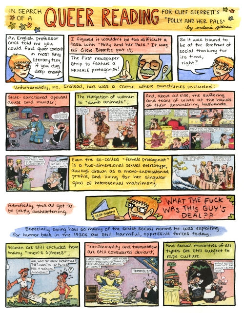
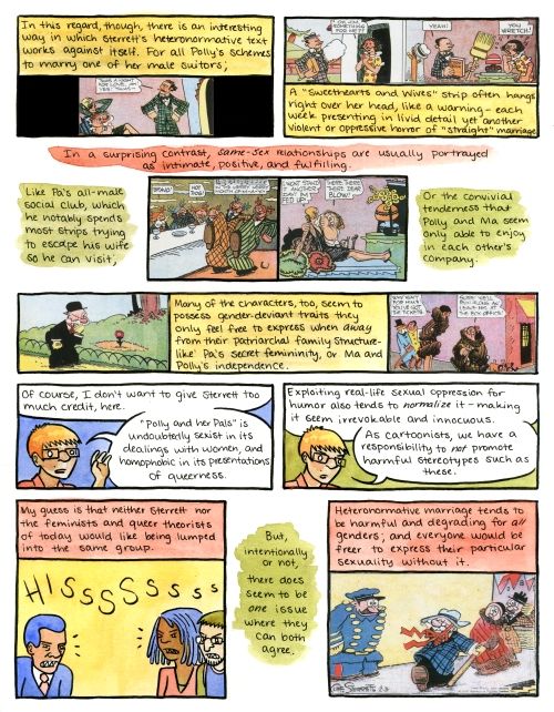
    Survey 1 Comic Strip Essays: Melanie Gillman on “Polly and Her Pals”

    Note: This is the sixth in a series of essays written (and, in this case, drawn) by the current Class of 2012 for Survey of the Drawn Story I, CCS’s comics history class. They are posted here in approximate chronological order of when their chosen subjects—comic strips—were either first published, or in their heyday.

    These were class assignments, and should be enjoyed in that context; these are not necessarily indicative of the work the individual artists/writers would do in paid professional venues. This is work assigned in class with a tight deadline, completed while juggling many other class assignments. That said, it is all of high caliber, or we would not be sharing it with you here. Enjoy!

    Students have the option to either write an essay, or to draw their essay in comics form. This is the first of the comics-format essays we’re presenting; enjoy! There are more to come. Survey I instructor Stephen Bissette has added the author info and “further reading” notes after this comics-format essay.

    NOTE: To enlarge these comics pages for easier reading, just click on the image itself to open larger scans in another window.

    ________________________________________________


    [The above is ©2010 Melanie Gillman, all rights reserved; it is posted with permission.]

    ________________________________________

    About the author/student:

  • Melanie Gillman‘s blog/website Contriveathon is here, and it’s full of art, writing, comics, links, and more; explore and enjoy!

  • Melanie also has shared her comics online at Sub-Scribe (here’s the link)
  • and at ColoredChalk.com (here’s that link), among others.

  • (PS: You can also visit Melanie on Facebook, if she chooses to ‘friend’ you, natch.)
  • _______

    Further reading & resources:

  • Cliff Sterrett‘s The Complete Color Polly and Her Pals, Vol. 1 (1991)
  • and The Complete Color Polly and Her Pals, Vol. 2 (1991), though long out of print, can still be found on amazon.com and via other online venues.

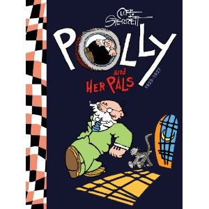
  • You can presently pre-order the forthcoming Polly and Her Pals: Complete Sunday Comics 1925-1927 at amazon.com, too (here’s that link).

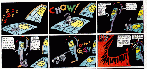
  • We also recommend you check out Barnacle Press‘s gallery of Cliff Sterrett‘s Polly and Her Pals comic strips (various, from 1914-1936, incomplete) which are free and visible online right now via this link. Enjoy!

  • A number of Polly and Her Pals collections are in the Schulz Library‘s permanent collection.

    Survey 1 Comic Strip Essays: Sean Knickerbocker on “Mutt and Jeff”

    Note: This is the fifth in a series of essays written by the current Class of 2012 for Survey of the Drawn Story I, CCS’s comics history class. They are posted here in approximate chronological order of when their chosen subjects—comic strips—were either first published, or in their heyday.

    These were class assignments, and should be enjoyed in that context; these are not necessarily indicative of the work the individual artists/writers would do in paid professional venues. This is work assigned in class with a tight deadline, completed while juggling many other class assignments. That said, it is all of high caliber, or we would not be sharing it with you here. Enjoy!

    All illustrations and captions in this particular post were incorporated into the original essay, along with captions or comments in brackets [like this], by the Survey I instructor Stephen Bissette, to enhance this public post, as were the author info and “further reading” notes after the essay and author’s footnotes.

    ________________________________________________

    “Mutt and Jeff” and Bud
    by Sean Knickerbocker

    Mutt and Jeff by Bud Fisher was one of the earliest successful daily comic strips. It is often cited as being the “first comic strip” but many have brought up the notion that Bud Fisher may have gotten the idea from a daily strip called A. Piker Clerk by Clare Briggs, which ran in the Chicago American in 1903, four years before Bud Fisher’s first strip was ever published. It is also worth noting that Mutt & Jeff was originally titled A. Mutt; the original focus of the strip was on horse racing and gambling. Most of the strips followed a strict formula and featured several key tropes.

    Some of the more common tropes in a Mutt and Jeff strip include the classic “plotz” as well as characters who had their wrists bent back in such a way where their fingers jutted out to create this feather aesthetic in the hands. The characters were mostly drawn in profile with an occasional three quarters view of a character’s face. Mutt would often jump out of a window. A very common composition was a broken window with Mutt’s feet jutting out of the window frame. Another common final panel for the strip would be Mutt rushing to a bookie window. The gesture for this panel was almost always the same, all four limbs would be sprawled out, the feet wouldn’t be touching the ground, this created a radial design around the character that really expressed movement and excitement very well.

    Bud Fisher’s strip was featured as a daily in the sports section of The San Francisco Chronicle being that Mutt and Jeff was one of the earliest comic strips, there wasn’t a comics section in any newspapers at the time.  A. Mutt was almost entirely the same joke week after week. Mutt would go to the racetrack and have a hunch for a certain horse, he would bet an enormous amount of money on the race, and then more than likely loose it all. He would then have to go home and apologize to his brutish wife. I think the humor of the strip really derives from observing a character do exactly what has become expected of them to do. The humor comes from familiarity and comfort with the strip, that isn’t to say that the strip could have lasted nearly as long as it did without introducing new conflict.

    In March of 1908, the character “Jeff” was introduced. Jeff was a stout character while Mutt was a tall and gangly character, many have said that this duo created a genre of slapstick and vaudeville acts. I do believe it’s true that the strip might have inspired some similar vaudeville acts, but I think it’s worth noting that there is something inherently humorous about juxtaposing a tall, skinny character with a short, fat character. There is a visceral level of humor in seeing these two images collide; it’s a subconscious tension that is created when this sort of thing happens. Other entertainers of the time may have caught on to that idea and incorporated this into their act, but I don’t think audience members do or have ever thought “Oh like Mutt and Jeff” while seeing Laurel and Hardy. As far as character design goes, it’s also a really smart move. Having the two main characters that have exact opposite basic features guarantees that there will never be a confusion as to who is who. I think Clarity is one of the great strengths of this strip.


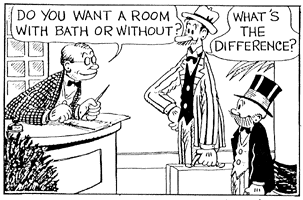
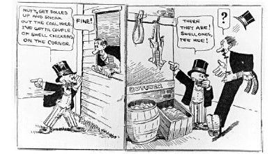
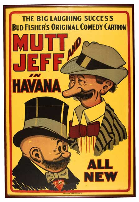
    [Mutt and Jeff by Bud Fisher, circa 1912. Original art scan from http://www.jhalpe.com/media/view/9/page:12%5D
    ________________

    The strip had an unusually wide format, it was originally designed to run the width of a newspaper page and be a single tier. The end result is this really long and narrow strip that almost has a film reel quality to it. I think this narrow format really forces the eye to move at a certain sort of fast pace, almost creating this Zoetrope kind of aesthetic and movement. The “camera” is almost always static, there are no close ups, long shots, high angles, or low angles. I would imagine the reason for this being that cinema was still in it’s infant stage while vaudeville and theater were still more common events. It’s interesting to point out that comics may owe just as much to film as modern film owes to comics. Bud Fisher used backgrounds sparingly and mainly focused on character gesture as well as dialogue. Besides the fact that Bud Fisher didn’t like drawing, I think it also plays to the strength of the medium. Comics can gave the reader an impression of an environment with just a few line strokes, a little bit goes a long way and it’s interesting to see this idea going almost all the way back to the beginning of the modern comic strip. Laziness aside, Fisher was right to use backgrounds sparingly. Not only does the eye focus on the movement of the characters but there is also never any confusion as to where a panel begins or ends. Bud Fisher employs the method of not using gutters, I would imagine he didn’t use gutters mainly because gutters were uncommon for the time but it really lends to the Zoetrope effect I spoke of earlier. Had Fisher been more of a draftsman and rendered more lush environments, the panels would have become muddy and the strip would have lost some clarity.

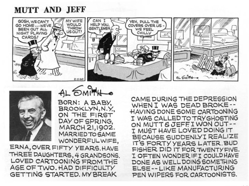
    By 1921, Bud Fisher was making $4,600 a week and then decided to hire ghost artists to draw Mutt and Jeff. Bud wasn’t a big fan of drawing, he was more interested in attending social events and squandering his money. Two of the ghost artists Bud Fisher had hired were Billy Liverpool and Ed Mack. George Herriman and Maurice Sendak had also been assistants for Fisher [generations apart – SRB]. Bud Fisher had assistants as early as 1918 but it wasn’t until 1921 that he had begun to rely on his ghost artist to do entire strips. Billy developed the Sunday topper called Cicero’s Cat in 1934. In 1932 Ed Mack had passed away which opened up a new position in the Mutt and Jeff studio. Al Smith was hired in 1932. Smith had worked on the strip from 1932 up until 1954 with his work signed as Bud Fisher. Fisher had passed away in 1954 and Al Smith began to sign the work as his own, he continued to do so up until his retirement in 1980. The strip continued for two more years and was drawn by George Breisacher. In 1982 the strip was cancelled due to lack of interest and dwindling readership.

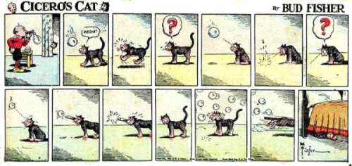
    Cicero’s Cat was an interesting strip all on it’s own. It was a mostly pantomime comic strip about a cat named Desdemona. Desdemona was Cicero’s pet, Cicero was Mutt’s son. Desdemona was a pretty obscure character but it seems like it was just an excuse for Billy Liverpool to stretch his storyteller legs a little bit. Desdemona has a very similar look to Krazy Kat but isn’t bipedal like Krazy.

    It’s a miracle that the strip had lasted as long as it did. The interest in the strip was waning in the late 1940’s but was given a boost in readership in the 50’s when President Eisenhower praised the strip. The strip regained some popularity again in the 70’s due to a nostalgia craze. Mutt and Jeff was syndicated for 73 years. The strip had passed through the hands of many different artists and the strip’s style evolved over time, eventually the strip’s style was more identifiable as Al Smith instead of it’s original creator, Bud Fisher.

    [Mutt and Jeff and Cicero, strip by Al Smith, circa 1963.]
    ____________________

    Bud Fisher was an innovative cartoonist in the ways of business as well. Fisher owned the rights to Mutt and Jeff and he became very wealthy because of it. Early on during the success of his strip, Bud was able to hire ghost artist to do his strips for him. Little is known about Bud’s involvement with the strip at this point in his career, but I think it would be fair to say that much of the praise I give to Bud Fisher is misdirected, in fact, it’s these ghost artists that probably deserve most of the credit. So, not only was Bud a trailblazer for creator rights, he was also ironically a trailblazer for the ongoing exploitation of non business savvy cartoonists all over the world.

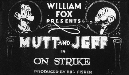
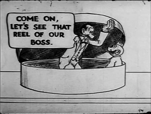
    In 1916 Bud Fisher had licensed his strip to be an animated cartoon short. Mutt and Jeff shorts became very popular and over 300 shorts were created of Mutt and Jeff. It was the second longest running movie serial, next to Krazy Kat. In 1918 Mutt and Jeff started running a Sunday strip, this is often cited as the point when Fisher had started having assistants to help with the strip. Between 1918 and 1934 it is a unsure how much involvement Fisher had with the strip, but in 1934 it became well known fact that Fisher was completely finished with the strip and relied wholly on his ghost artists.


    [Frame from the animated cartoon Mutt and Jeff Go On Strike, 1920.]
    _________________

    Mutt and Jeff had also reprinted in a couple of different comic books. Most notably, Mutt and Jeff had reprinted in what is widely considered to be the “first comic book” which was Famous Funnies #1. Mutt and Jeff had also later reprinted in DC’s All-American Comics.

    Bud Fisher lived very comfortably on the money that his strip had made. In 1915 Bud Fisher had a dispute with William Randolph Hearst and he had decided to move his strip to Wheeler Syndicate. The deal with Wheeler Syndicate gave Bud Fisher 60% of the gross revenue from his strip which was a drastic income increase for Fisher. In 1915 Fisher had earned over $150,000. By the 1920’s Bud was raking in over $250,000 due to tremendous growth in merchandising. Regardless of all the money Fisher had managed to make in his career as a cartoonist, he managed to squander away most of his wealth before he died in 1954.

    Mutt and Jeff established a cartoon aesthetic early on that has influenced many generations of cartoonists. Two cartoonists that appear to have a strong influence are Robert Crumb and Kevin Huizenga. Crumb employs a lot of these gangly characters with floppy feet and cheap suits as well as the highly stylized faces and gestures. Crumb’s mark making is also very similar to Mutt and Jeff. I’m specifically thinking about the technique that Crumb employs while rendering shading and texture into a characters pants. Both Crumb and Fisher use this contour hatch technique that suggests texture as well as form to the characters. Crumb also uses a lot of characters wearing these old fashioned suits and although it may be Crumb being nostalgic, it does specifically evoke images of Mutt.

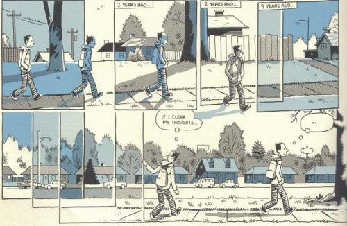
    [Kevin Huizenga, Ganges #1 (2006).]

    Kevin Huizenga is a more contemporary artist who also seems to employ some of the same tricks that Bud Fisher and his assistants used. The black button eyes, the wispy line weight rendered with nib. Huizenga also uses the contour line hatching in his character’s pants as well. Perhaps it’s a short hand that has stuck with cartoonists over the years.

    While I was reading some Mutt and Jeff collections, I couldn’t help but notice an incredible amount of “Black Face” characters in the strips early run. The strip loses a lot of personality when I see these characters in the strip, it feels like another artifact of America’s struggle with bigotry that continues to this day. My argument is, that not only is “Black Face” incredibly offensive, but it’s also just really bad character design and probably even more so, it’s really lazy writing.

    Strips without gutters have come back in style recently as well, although I think many contemporary cartoonists have failed to use this method effectively. Some cartoonists have turned the idea on it’s head and created a visual unity in their pages by using intricate backgrounds that repeat in a sequence and create this textile pattern that makes a page feel whole albeit difficult to read. Ron Rege Jr. comes to mind.

    [The above essay is ©2010 Sean Knickerbocker, all rights reserved; it is posted with permission.]

    ________________________________________

    About the author/student:

  • Sean Knickerbocker has a lively blog/website, Sean Knickerbocker vs. Comics, which just about says it all.
  • (PS: You can also visit with Sean on Facebook, if you wish and he chooses to ‘friend’ you!)
  • _______

    Further reading & resources:


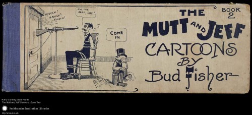
    [Cover to The Mutt and Jeff Cartoons: Book Two, 1911, from the Ball Publishing Company. These were among the first American bound comic strip collections ever published, and historically among the first “American comic books” sold. Image from Smithsonian Institute Libraries.]

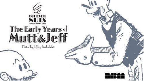
  • NBM’s collected edition of Bud Fisher‘s Mutt and Jeff, Forever Nuts: The Early Years of Mutt and Jeff (2007), is still available at amazon.com; here’s the link.

  • The current availability of the rare, early 20th Century Ball Publishing Company and Cupples & Leon Company reprint collections of The Mutt and Jeff Cartoons can also be found at abebooks.com. Happy hunting!
  • We also recommend you check out Pulpnivoria‘s gallery of Al Smith‘s Cicero’s Cat comic strips, which are free and visible online right now via this link. Enjoy!

  • A number of Mutt and Jeff collections are in the Schulz Library‘s permanent collection.

  • For more info on the Mutt and Jeff animated cartoons, and links to viewing some of them, start at CartoonBrew.com‘s animation website/blog. Here’s a link to a 2008 post citing a recent preservation effort dedicated to rescuing some of the Mutt and Jeff animated shorts.
  • Survey 1 Comic Strip Essays: Rio Aubry Taylor on “Little Nemo in Slumberland”

    Note: This is the fourth in a series of essays written by the current Class of 2012 for Survey of the Drawn Story I, CCS’s comics history class. They are posted here in approximate chronological order of when their chosen subjects—comic strips—were either first published, or in their heyday.

    These were class assignments, and should be enjoyed in that context; these are not necessarily indicative of the work the individual artists/writers would do in paid professional venues. This is work assigned in class with a tight deadline, completed while juggling many other class assignments. That said, it is all of high caliber, or we would not be sharing it with you here. Enjoy!

    All illustrations and captions in this particular post were incorporated into the original essay, along with captions or comments in brackets [like this], by the Survey I instructor Stephen Bissette, to enhance this public post, as were the author info and “further reading” notes after the essay and author’s footnotes.

    ________________________________________________

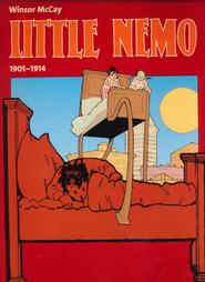
    Little Nemo: 1904-1915
    by Rio Aubry Taylor

    This collection, published in 2000 by Taschen under the Evergreen imprint, purports to include every weekly Sunday strip featuring Little Nemo from 1904 to 1915.  Though not presenting Winsor McCay’s strips at their original size of 16 x 21 inches, this book’s sheer girth makes up for its lack of dimensions.  As it is, the measurements of the book (about 9.5 x 12.5 inches) ensure that the strips are large enough to be readable and that the collection on a whole is not unwieldy.  The reproduction of the colors and line work are crisp, bright, and pleasing to the eye and, of course, McCay’s art is beautiful and surreal.  This collection showcases some of the best surreal comics produced at a critical point in the evolution the medium.  It also demonstrates how McCay’s work does a better job at dreamlike story telling than either the traditional literature that came before or the modern media of today.

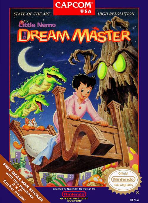
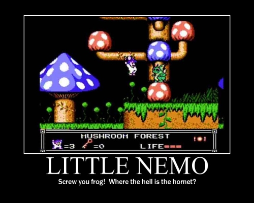
    Growing up in the 80’s and 90’s, I had always known that the character of Little Nemo existed in the multifarious milieu of children’s entertainment.  I did not, however, realize his extreme significance to the history of American cartooning.  I mostly knew Nemo as the star of the popular Nintendo title Little Nemo: The Dream Master, which I vaguely recognized as being based on an animated film. The game had Nemo explore large multi-platformed levels as he threw candy at animals who then let him ride on their backs in order to defeat enemies.  As with many video games of this type, I absolutely loved it, and the surreal backgrounds and characters seemed totally natural to my young mind.  Looking back on it now, the game’s very existence is a standing testament to McCay’s vision and influence.  I sometimes wonder how many people my age got turned on to McCay’s strips after being introduced to the character in the video game scene.

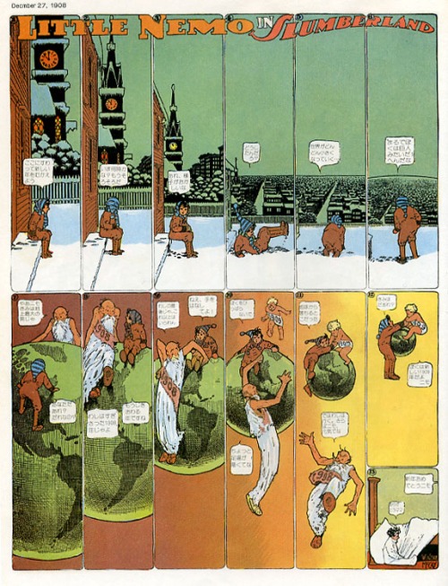
    As is stated in Bill Blackbeard’s brief introduction, the  original run of Nemo’s adventures is called Little Nemo in Slumberland but was changed to In the Land of Wonderful Dreams in 1911 when McCay changed publishers.  The earliest strips showcase Nemo’s attempts to reach Slumberland through his dreams, always aided by a different denizen of King Morpheus, the ruler of said kingdom, who wishes for Nemo to be a playmate for his daughter.  The format of these strips is straightforward and evidences McCay’s evolving style and penchant for storytelling.  In these simple adventures Nemo struggles to make it through dangerous and frightening dreamscapes with the aid of King Morpheus’s various strange and fantastical servants.  However, by the end of each strip Nemo always seems to get frazzled and lose his bearings, causing him to wake up in a tearful fright.  The last panel of every strip shows Nemo suddenly awake in his bed, where he sometimes must be consoled by one of the adult members of his family.  These early pieces often make gags of Nemo’s parents scolding him for eating some strange combination of food before bed (“The next time your mother lets you eat raw onions and ice cream before bedtime I’ll, well…”).

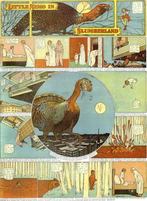
    Though I find these stories incredibly entertaining, I wonder if some of them may have been rather frightening to children at the time; it seems as though McCay may have intended for his strip to be read by a slightly more mature audience. For example, at one point Nemo must travel through a kingdom consisting of people made entirely of glass.  By the time the strip is over Nemo has accidentally shattered all of  that week’s supporting characters.  In another strip a giant turkey tries to bring Nemo to Slumberland by devouring his house and everything in it. Nemo’s parents feature in this dream, but get lost when the Turkey drops Nemo into a sea of cranberry sauce.  Nemo then wakes up wondering about the fate of his parents.  The strip seems to imply that Nemo’s parents might have died within his dream, a heavy notion for the average child!

    I find the first twenty or so weeks worth of material to be gratifying but slightly irksome to follow.  These early strips showcase McCay’s evolving styling as a cartoonist as he experiments with how best to present his narrative.  My largest trouble with these strips are the continually present captions at the bottom of each panel.  These captions narrate the action of the panels in such a way as to make the pictures redundant.  I find the captions especially distracting because the sentences usually do not end with their connected panels, but rather continue to the next.  This creates a disconnected flow by allowing for two parallel tellings of the same story.  The captions appear to be broken down by an arbitrary and predetermined amount space rather than anything else.  Though this style can sometimes be aggravating for the modern reader, it serves as a piece of history for those interested in the evolution both of McCay’s style and comics in general. Of course, McCay was a pioneer in his field and it did not take him long to modify his work and make it better.  In fact, throughout this entire collection the observant reader can see evidences of McCay’s experimentation and breakthroughs.

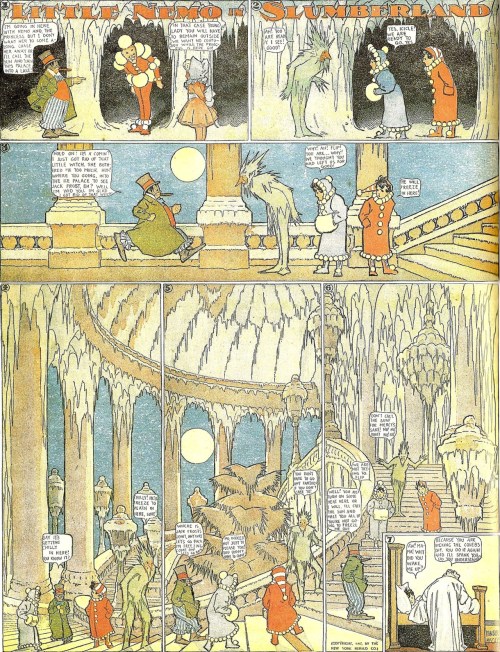
    [Flip and King Morpheus from Little Nemo in Slumberland]

    After about twenty weekly strips McCay begins to summarize each strip at the outset before telling his stories simply with the action and dialogue within the panels.  This lends to a more pleasant reading experience that gets even better ten weeks later when McCay abandons narrative captions altogether and begins to tell his stories almost entirely through dialogue.  Though some exposition sometimes occurs at the beginning of each strip, the author usually incorporates it into the tales through conversations between the characters or in-story written communication such as signs or letters.

    As stated above, the earliest strips are simple and can generally be seen as stand alone episodes.  The story really picks up, however, when McCay introduces Flip, who soon becomes a main character.  Once introduced, and until Nemo finally meets his future playmate, Flip’s sole existence seems to be to divert Nemo from reaching the princess, whom Flip would like to woo himself. Standing in stark contrast to Slumberland’s motto of “don’t wake up,” Flip’s hat actually reads “wake up,” and when he first encounters Nemo that is exactly what our protagonist does!  The initial rivalry between Flip and Nemo gives McCay a solid chance to elaborate on both Nemo and Flip’s respective personal characters. Whereas the previous strips present Nemo as a curious but rather impersonal hero, these strips showcase Nemo’s general nobleness and outstanding sense of what is right and wrong.  As the story progresses, these traits contrast heavily with Flip’s rascally and somewhat needy personality.

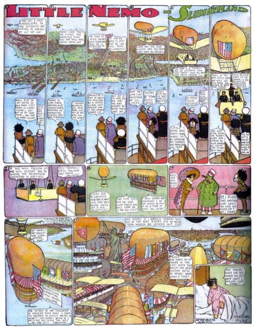
    [In this Sunday, November 13 1910 episode of Little Nemo in Slumberland, Nemo and his pals fly over Coney Island, such as it was before the fire that wiped out much of Coney Island’s own “Dreamland” and more. In this story sequence, Flip ended up lost on the subway system and stranded in Brooklyn!]

    _________

    Though paired together as adversaries, Nemo helps Flip on more than one occasion, simply because he believes helping people is the right thing to do.  When a Slumberland ally cautions Nemo not to help Flip, who is marooned at the top of a tower after a failed flight attempt, Nemo replies “I can’t help it.  I can’t see anybody in such a fix.  No Siree!”  Nemo, who at this time has become a giant, then proceeds to help Flip down, but is later punished for his deed by being shrunk down to mouse-like proportions.  This, however, does not stop Nemo some twenty strips later from saving Flip from being executed by King Morpheus’s royal guard.  This marks a major change in the series as Flip evolves from Nemo’s supposed worst enemy to a beloved and cantankerous ally.

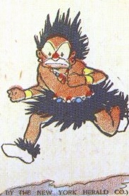
    At this point McCay’s narrative really reaches a stride.  At first Nemo and the Princess constantly try to avoid Flip as though he is an annoying neighbor, but later join him in a series of adventures outside and within the royal palace of Slumberland.  During the course of their exploits they meet a host of interesting and colorful recurring characters, and even pick up another regular  ally in the form of the unfortunately stereotyped Imp.  The Imp, who appears in a supposedly tribal getup and speaks an incomprehensible nonsense language, follows Flip, Nemo, and the Princess on their adventures.  Though McCay depicts him outwardly as a savage in black-face, the Imp proves to be a valuable companion and friend to the characters who gladly employ his help when needed.  The stereotypical appearance of the Imp that McCay employs, though popular at the time, is now recognized by readers with modern sensibilities to be undeniably racist.  The fact that the Imp becomes an important part of Nemo’s entourage, however, is testament to both Nemo and the Imp’s noble character and McCay’s sense of youthful friendship.

    The question remains:  what benefits can a modern audience get from reading this collection of strips? These artfully rendered adventures offer something that can only be hinted at outside the comics medium and is still, unfortunately, rarely found even there: a truly surreal entertainment experience. Though technology has grown in leaps and bounds, these strips still represent an artistic peak in dreamlike storytelling, for which the medium of comics presents a unique link between more traditional literature and newer forms of entertainment technology.

    McCay’s Nemo strips offer superb and fantastical art that bring the reader into a special world that could not be presented in any other way.  Whereas traditional literature can present a narrative with language alone, comics have the power to immerse the reader in a visual world of the artist’s choosing.  In this, McCay succeeds in presenting his own unique graphic language in a precise and insightful narrative.  Written descriptions could simply not suffice to describe the truly splendid imagery he creates to tell his stories, as neither could a draftsman of lesser talent.  By the same token, newer technology such  as film, though offering a more sensorial experience, has the tendency to reveal too much.  What traditional literature lacks in showing a precise artistic vision, modern film makes up for by bombarding the senses with information, thereby disallowing the viewers’ imaginations from taking hold and leading them through the narrative.  Only the medium of comics could succeed in presenting the truly surreal world of Slumberland.

    The benefit of comics, which McCay uses succinctly to his advantage, lies in the fact that actions occur between the panels.  In every comic the artist must choose which scenes to present to his audience, and which actions to leave out.  The chosen scenes must be precise enough to continue the proceeding narrative.  The audience then fills in the information between the panels in much the same way a reader of traditional literature might form images of the story in his or her mind.  In a more mundane comic the panels flow continually through time and space in a linear manner.  McCay, however, has the advantage of setting his characters in a world where the normal laws of space and time do not exist.  This means that he has the freedom to manipulate the rules to an almost infinite extent in order to continue his story telling.  His genius lies in the fact that his comics remain acute and readable, containing a clearly identified story and progressive narrative while simultaneously bending the normal rules that readers must submit to in everyday waking life.  Through reading these comics the reader becomes a co-creator in McCay’s surreal world, subconsciously choosing for herself the timings and specifics of the strange occurrences between the panels.  For this reason McCay’s comics, and others like his, might represent the entertainment medium that comes closest to actually emulating a real dream.

    McCay touches on the sorts of experiences that anyone, especially children, can relate to.   Because the normal rules do not affect his characters, they exhibit a sense of youthful exuberance, unbounded by any fetters except for that of the author’s imagination, which he consistently exhibits to be quite extensive.  Nemo and company grow and shrink, meet strange and interesting creatures, and even travel to Mars, none of which seems out of the ordinary for the citizens Slumberland. Though many people may not realize it, they essentially live two lives, separated by their level of awareness and consciousness.  Most people’s dream lives remain essentially unexplored, but McCay brings the regular ritual of dreaming into full focus.  The strange adventures of Nemo and his friends showcase that other part of the human condition, the part most people neglect to talk about.  The human mind is truly fantastic, and in its most creative depths can bring forth stories that no conscious mind could.  McCay was able to reach into those depths in order to create a delightful experience that can still be enjoyed today, and for that we should be grateful!

    [The above essay is ©2010 Rio Aubry Taylor, all rights reserved; it is posted with permission.]


    ________________________________________

    About the author/student:

  • Rio Aubry Taylor has an older blog/website, Light Riot, which you can access with this link.
  • PS: Rio‘s former art/living space also made the grade in photographer Abby Banks’s photo book Punk House: Interiors in Anarchy, which you can purchase here.
  • (PPS: You can also visit with Rio on Facebook, if he chooses to ‘friend’ you!)

  • Further reading & resources:

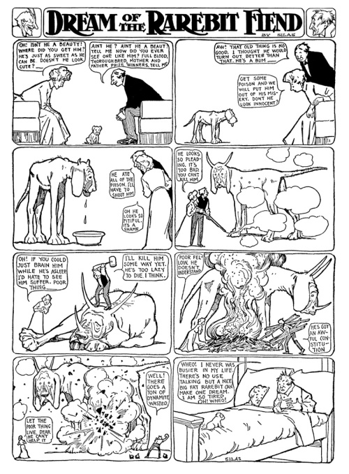
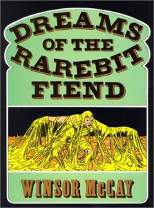
  • For more on Winsor McCay’s influential early 20th Century comicstrip creations, see Survey 1 Comic Strip Essays: Katie Moody on Winsor McCay’s “Dream of the Rarebit Fiend.” Click this link!
  • Also be sure to read Survey I classmate Bill Bedard’s own essay on Winsor McCay’s “Little Nemo in Slumberland.” Click this link!
  • Though the book is now out of print, you can purchase your own copy of Little Nemo: 1904-1915 at amazon.com; here’s the current availability at amazon.com
  • and the current availability at abebooks.com. Happy hunting!
  • We most highly recommend editor/publisher Peter Maresca’s marvelous Little Nemo in Slumberland: So Many Splendid Sundays!, which reproduces the McCay strips in their original Sunday page dimensions; copies of are still available at amazon.com. Here’s the current availability.

  • Both books are in the Schulz Library‘s permanent collection.

  • We also most highly recommend the followup volume Little Nemo in Slumberland: Many More Splendid Sundays, Volume 2; copies of are still available at amazon.com. Here’s the current availability.

  • CCS instructor Stephen Bissette interviewed Peter Maresca back in November of 2005, when the first volume of Winsor McCay’s Little Nemo in Slumberland: So Many Splendid Sundays! was first published. Here’s the complete interview, archived on the original Myrant blog site.
  • Survey 1 Comic Strip Essays: Bill Bedard on “Little Nemo in Slumberland”

    Note: This is the third in a series of essays written by the current Class of 2012 for Survey of the Drawn Story I, CCS’s comics history class. They are posted here in approximate chronological order of when their chosen subjects—comic strips—were either first published, or in their heyday.

    These were class assignments, and should be enjoyed in that context; these are not necessarily indicative of the work the individual artists/writers would do in paid professional venues. This is work assigned in class with a tight deadline, completed while juggling many other class assignments. That said, it is all of high caliber, or we would not be sharing it with you here. Enjoy!

    All illustrations and captions in this particular post were incorporated into the original essay by its author, Bill Bedard. Bill also prepared them all for this online posting; thanks, Bill! Unless otherwise noted, any images accompanied by captions or comments in brackets [like this] were added by the Survey I instructor, Stephen Bissette, to enhance this public post, as were the author info and “further reading” notes after the essay and author’s footnotes.

    ________________________________________________

    Little Nemo in Slumberland
    by Bill Bedard

    Little Nemo in Slumberland by Winsor McCay is a masterful work. Published Sundays off and on from 1905-27, the strip follows the adventures of a tousle-haired boy in his dreams. The boy, Nemo, first spends his time in dreams attempting to reach Slumberland to be the playmate of the Princess, daughter of King Morpheus of Slumberland. In later strips, having achieved his goal and reached the princess, the strip follows the antics of Nemo and friends through the madcap and surreal landscapes of Slumberland. McCay’s work was ground breaking at the time, and nearly a century later still considered to be a perfect example of what potential for excellence the comics medium holds.
    While Little Nemo has ignited the imagination of many artists to chronicle their own dreamlands, some successful contemporary artists look back on Nemo with a critical eye, taking umbrage with McCay’s lines or the attention lavished upon the surreal landscapes at the expense of the characters. These criticisms are to a degree very valid, but must be considered not only in the framework of a single Sunday page, but as an ongoing part of thousands of single stories that work together to tell a narrative. In this way, a character like Nemo, who may appear flat may in fact be a multifaceted hero whose character and personality is simply divulged over a course of months and years.

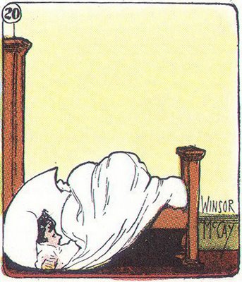
    Nemo’s bed goes for a walk; 1905, The New York Herald.

    _____

    Finding Fault with Nemo

    One of the most common criticisms that Little Nemo receives is that Slumberland, along with all the other fantastical dream lands that are visited in Nemo, including the North Pole and Mars, are treated with more deference than the human/dream beings are afforded. Bill Waterson of Calvin and Hobbes fame lamented in an article:

    “To be perfectly honest, however I admire Little Nemo more than I actually like it. McCay was clearly more interested in his stage than in his actors, and a stage, no matter how grand, can’t carry a play. The inventive visual effects notwithstanding, I can’t read the strip without thinking how much more enchanting Slumberland would be if the characters, rather than the backdrops and costumes, advanced the story.”

    Watterson called the characters “cardboard dressup dolls” and cited the word balloons done by McCay as evidence that story was a pale second in comparison with the design of the world itself. He pointed out that the balloons tend to seem like a squished in afterthought- not part of the page design until the eleventh hour. Watterson also noted that dialogue generally fails to use characters’ voice as a way to describe them. He excluded Flip Flop the clown from this generality, but Nemo and the rest had nothing but “flat, exclamatory dialogue or overuse of exposition.”

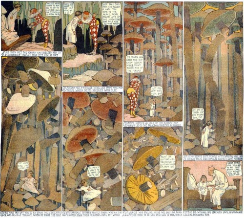
    In this strip from the NY Herald, Thanksgiving Day 1905, Nemo doesn’t say anything in word balloons that doesn’t rehash the captions or end up as a call for his mother or father. This doesn’t stop the strip from being an ingenius reversal of who normally gobbles whom on Turkey Day. The title panels and page design on the whole are excellently crafted, and even the celery stalk forest mirrors the white verticals of the nightshirts in the upper panels.

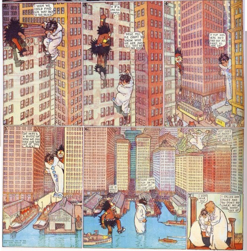
    In this sequence from 1905 in the NY Herald, Nemo and the Imp are lost as giants in a city. The dialogue balloons do not actually mirror the action, but still may feel as if they were put in as “afterthoughts” by McCay, due to the their organic and “smooshed” look.

    ______________

    Measuring Up to the Environment

    In some cases Watterson and others’ claims are certainly true, and the interaction and dialogue between Nemo, Flip and other denizens of Slumberland appears flat in comparison to the charm and personality that Slumberland itself can affect during the course of a Sunday strip.
    However, a close examination of McCay’s work as a whole reveals a variety of personality and growth for the main characters. Nemo’s own reticent nature may have been a purposeful choice on the part of McCay.

    Richard Marschall, editor of The Best of Little Nemo in Slumberland, wrote in his introduction to that book that Nemo’s name, the Latin translation of which is “No-One,” may actually have been a conscious decision to keep the main character as bland or passive as possible. According to Marschall, Nemo is the “every-man dreamer” who corresponds to the reader. Famed illustrator Maurice Sendak wrote of Nemo that one reason for his quietude and reticence during the journeys through Slumberland is that “Nemo lacks savior-faire. He is naive and as simple and straightforward as apple pie.”

    Descriptions of McCay’s characters as one-dimensional suggest readings of McCay’s work as single pages instead of as parts of a larger narrative whole. Nemo isn’t passive to the actions of Slumberland and supporting cast. Flip, the main antagonist and later a sort of “buddy” for Nemo may jump off the page at times with his zany jealousy and rivalries, but Nemo grows into his role as Slumberland explorer.

    Sendak actually laments one of the ways in which Nemo grows into his character, where Nemo and Flip come to blows, and Nemo wins. Sendak wrote: “A sad victory: Nemo exchanges childhood for manhood, never thinking he might have both.”

    Even in strips sans Flip, where Nemo plays off the Princess or a missive from Morpheus, his own personality comes through. In the case of Somnus, the horse he is given to arrive in Slumberland, Nemo is challenged to a race and lets his pride get the best of him—he is thrown off the horse and lands in bed. (1904, NY Herald)

    A second example is the moment where Nemo, overwhelmed by his desire for the beautiful Queen Crystalite, takes her in his arms in a big kiss and breaks her into a million pieces. (1906, NY Herald)

    _______

    While these emotive experiences do seem to fit in Sendak’s assertion that Nemo is perhaps exchanging his boyhood for manhood, Nemo’s personality does not seem to be permanently altered by the strips. The next Sunday, he is back to be being an unsure and cautious dreamer in a world which, many times, turns dangerous at any moment. These moments of assertive (and usually wrong-headed) “adultness” combined with his passivity and fearful approach as a child in a dangerous dreamworld serve to make Nemo a complete whole, instead of a onedimensional character who serves as a foil for the Slumberland and Flip. Just as dreams can have the dreamer childlike and afraid one night and aggressive the next, McCay allows Nemo the full range of possibilities.

    Above and below: Three examples from the NY Herald of Nemo being his non-character “coward” self afraid of an ogre, and then more expressive, five years later in an adventure on Mars.

    It’s Not All “Agout” Nemo

    Nemo isnt’ the only character who blossoms with a more complete reading of the work. Secondary characters evolve and change with the plot as well, as is the case when the brooding and wise Morpheus gets painful gout (NY Herald, 2 Jan, 1910) or later Nemo strips when the Princess and Nemo engage in play dates and get into trouble. Being secondary characters, they still aren’t as fully fleshed out as Nemo and Flip, but having them change means they are more than just the “brooding king” and “lonely princess” archetypes they seem at first brush.

    Gouty Morpheus, NY Herald, 2 Jan, 1910

    ________

    Hidden in Plain Sight

    What critics of the strip often forget is that Nemo, Flip and the denizens of Slumberland aren’t the only characters in McCay’s works. Slumberland itself is as much a character as any of the actors on its stage. When the strip was reinvented under a different name because of legal issues with the publisher owning the rights to the name of Little Nemo in Slumberland the strip name didn’t even include “Nemo.” Instead, it was penned as In the Land of Wonderful Dreams. Later, when the rights reverted and the strip was rebooted in the 1920s Nemo’s appellation did return. However, during the most popular Nemo strips (those taking place from 1908-1912) a main driving force behind action and narrative isn’t just the titular boy, it’s the world in which he finds himself.

    In Slumberland’s case many of the events that happen to normal comic book heroes, such as growth, change, conflict and resolution are present (sadly, most often the resolution for Slumberland is that the place falls to pieces or melts as a result of sunlight and deposits Nemo back into consciousness).

    In a typical Slumberland scene, Nemo is told not to touch something, he does, and as a result, unravels the very fabric of Slumberland. (1905, NY Herald)

    ______

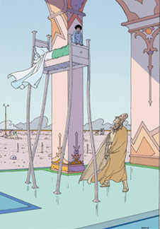
    Right: Famed European illustrator Jean Giraud, aka “Moebius,” cites Little Nemo as a great influence in his work and worked on his own version of the tale in 1994.

    Watterson also presented a critique of the design of Slumberland itself, saying that the environments look too “sterile” and, like his opinion of the characters, are more superficial than substantive. While McCay uses an art noveau line, which at times almost borders on (or also influenced– as in the case of many European artists like Moebius) the ligneclaire style, a question of sterility ends up really being a matter of taste. A reason for Watterson’s criticism could be simply that the differences between McCay’s architectural marvels and the and expressionistic planets or jungles that Watterson’s brushwork conjured are extreme. Again, it comes down to personal style. Watterson’s planets could not exist without Spaceman Spiff, but Slumberland doesn’t need Nemo to work.

    Great cartoonists like Watterson may not like McCay’s style, but there is no arguing with the care and talent with which McCay impregnated each page. “Every page is a marvel of design and ornament,” Watterson wrote. “The constant invention ,the playful distortions, the subtle coloring, the panoramas of architectural splendor… never has another comic strip taken such full advantage of the visual possibilities for surprise.”

    Sources: “A (Very) Short Bibliography”:

    Images and articles from The Best of LIttle Nemo in Slumberland, Richard Marschall. 1997, Stewart, Tabori and Chang, NY, NY.

    Quotes from Maurice Sendak were excerpted from his essay “An Elaborate and Audacious Fantasy,” first published in 1973.

    [The above essay is ©2010 Bill Bedard, all rights reserved; it is posted with permission.]

    ________________________________________

    About the author/student:

  • Bill Bedard has a blog/website, which you can access with this link. Pay it a visit, won’t you?

  • Further reading & resources:

  • For more on Winsor McCay’s influential early 20th Century comicstrip creations, see Survey 1 Comic Strip Essays: Katie Moody on Winsor McCay’s “Dream of the Rarebit Fiend.” Click this link!
  • You can purchase your own copy of The Best of Little Nemo in Slumberland at amazon.com; here’s the current availability.
  • We also most highly recommend editor/publisher Peter Maresca’s marvelous Little Nemo in Slumberland: So Many Splendid Sundays!, which reproduces the McCay strips in their original Sunday page dimensions; copies of are still available at amazon.com. Here’s the current availability.

  • This book is in the Schulz Library’s permanent collection.

  • We also most highly recommend the followup volume Little Nemo in Slumberland: Many More Splendid Sundays, Volume 2; copies of are still available at amazon.com. Here’s the current availability.
  • CCS instructor Stephen Bissette interviewed Peter Maresca back in November of 2005, when the first volume of Winsor McCay’s Little Nemo in Slumberland: So Many Splendid Sundays! was first published. Here’s the complete interview, archived on the original Myrant blog site.

  • Halloween Heroes of Vermont

    October 31st represents not only the end of a autumnal month here in Vermont with trees ablaze in their colorful death but a time consumed by costumed celebration. Betsey Swardlick (CCS ’11) below pens an essay on the connection betwixt the town of Rutland and the comics universe.

    White River Junction, a town that takes pride in its vibrant artistic community, has an annual Halloween Parade sporting human-sized butterfly puppets swooping above the crowd, a glorious, flame-belching Fire Organ, and a procession of costumed revelers wending their way through the town center. With over two dozen art studios nestled into the downtown this is not your Grandma’s holiday craft crowd. With the addition of The Center for Cartoon Studies in 2005, a yearly influx of cartoonists added yet another element of creativity to the town and to the parade.

    As the school gains national and international notice for its growing contribution to the comics field, the town can boast a unique place in the art world. White River Junction is one funky little Vermont town made famous by comics. But we have to remember that an hour to the west, the slightly larger town of Rutland has a venerable connection to comics and Halloween that has exercised some of the most creative and influential talents in the comics industry.

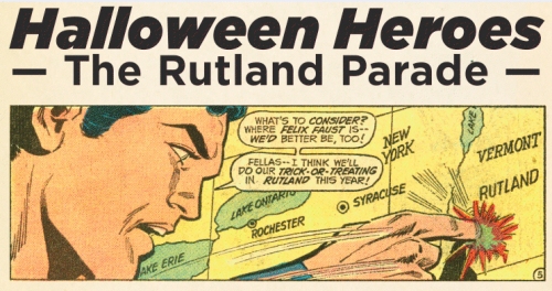
    In 1959, Rutland held its first Halloween Parade, consisting largely of the high school marching band and one kid in a Casper the Friendly Ghost costume. So how did this quaint bit of rural revelry become one of the largest and most beloved Halloween events in the country? How did it garner the notoriety to inspire DC and Marvel Comics to set superhero stories in its midst? Ask around and the locals will tell you about Tom Fagan.

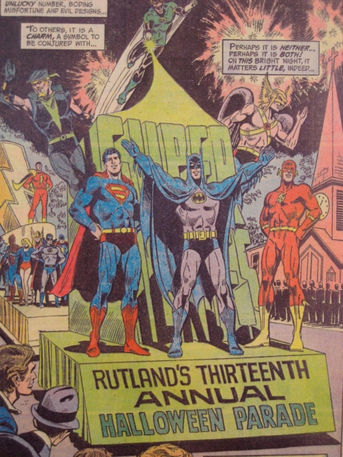
    Rutland local Tom Fagan saw the inaugural parade and thought, “Not bad, but I think it could be better.”Recreation Chief Commissioner John Cioffredi took him at his word and appointed him general chairman of the event for 1960. Fagan, an enthusiastic follower of DC’s Batman comics, chose the all-encompassing theme of “Creatures of the Night,” and set to work knitting hispassion for comics into his newly-acquired civic duty. The second Rutland Halloween Parade featured a Batman float, with the Caped Crusader himself (Fagan, incognito) as parade marshall. Fagan wrote letters to Detective Comics, the publisher of Batman and other titles starring heroes, such as Superman, informing readers that Batman was now the leader of the Rutland Parade. A tradition was established.

    Fagan’s love of comics infused the parade with an energy that kept Rutland engaged year after year. In that time before specialized comic book stores and only a very few, small comics conventions, there were few opportunities for comics fans to celebrate their interest. With Tom Fagan at the helm, the Rutland Halloween Parade grew from a simple town event to a celebration of comics fandom so great it spread not only to fans and to professional writers and artists of comics, but even to the content of the comics themselves. In 1965, Fagan attended a convention in New York city hosted by Dave Kaler, fan-turned-writer for Charlton Comics. Fagan invited Dave and another Charlton writer, Roy Thomas, to the Rutland Parade. By that time, the single Batman float had grown into a cavalcade of more and more comics characters, saluting the crowds and returning their cheers.

    The post-parade party for the volunteers added to the event’s appeal and quickly became legendary. Housed first in an old Victorian home on Pine Street, and later moved to the old Governor’s Mansion known as the Clement House, the party was Fagan’s “thank you” to all those who volunteered their time and energy to the parade. By the end of the 1960s, some 200 to 300 people flocked to the mansion each year. As Fagan attended more comics conventions he found the parade had started to build a reputation among cartoonists, some of whom remembered his letters in Detective Comics. Fagan would invite them to see the parade for themselves, and by 1968, notable DC writers such as Marv Wolfman, Len Wein, and Mark Hanerfield made the trek to Rutland.

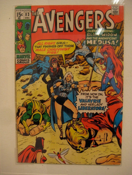
    In 1970, the bridge between comics culture and comics mythology was crossed when the Rutland Parade was written into the Marvel Universe. Roy Thomas (then working for Marvel), was so taken by the parade and its energy that he set Avengers #83, “The Lady Liberators,” in Rutland during the event. Thomas also wrote himself, Fagan, and Fagan’s wife Jeanie into the book, marking the first of many cameos of real people to be made by Marvel and DC staff in subsequent Rutland stories. The parade even inspired the first inter-company crossover in 1973, when Steve Engleheart, Gerry Conway, and Len Wein teamed up to write a three-part story featuring themselves, Tom Fagan, and heroes and villains from both the Marvel and DC universes. Between 1970 and the present, the Rutland Halloween parade was featured in no fewer than fifteen separate issues of multiple titles by Marvel, DC, and WaRP Graphics. The most recent appearance was in 1997, in DC’s Superboy and the Ravers #16.

    Although Tom Fagan had retired from his post as parade chairman by the mid-2000s, he continued to attend as a special guest and costume judge until his death in 2008, just a few weeks shy of Halloween. Though Fagan is gone, the spirit of the parade remains true to his original vision. The parade celebrated its 50th anniversary in 2009, and will continue to bring comics fans together for years to come.

    The Center for Cartoon Studies is proud to present this exhibit about Rutland’s Halloween Heroes, their parade, and their comics. Two small Vermont towns, not far apart, play unlikely roles in that most American of art forms, the comic book.

    -Betsey Swardlick (CCS ’11)

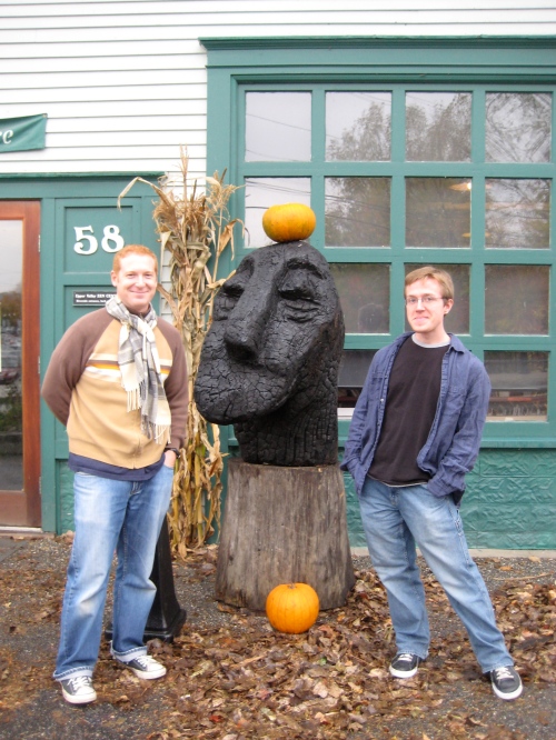
    The Halloween Heroes Exhibit will open this Friday, October 29th from 5pm to 8pm. Gallery hours will continue every Saturday from 10am to 2pm at the Center for Cartoon Studies in the heart of White River Junction, Vermont. You can’t miss us, we have a window display with a robot. To take part in the White River Junction GORY DAZE parade, please show up at the Main Street Museum at 9pm on Saturday, October 30th. It’s at 58 Bridge Street right by these wooden sculptures (charming cartoonists no doubt will be covered in Halloween frippery)

    To download this article, please click here.

    Jen Vaughn

    Halloween Horrors: Pre-Code Reprints Rule! Briefer’s Frankenstein from IDW

    We’re in an age of amazing reprint volumes resurrecting all genres of comics history—but this is the last week in October, so it’s time to carve out some space for two of the latest Pre-Code horror comicbook collections!

    And who better to begin with than…

    Frankenstein!!!
    _______________________________________

    Comics archivist/scholar/historian/collector/editor Craig Yoe has been behind some of the most invigorating of the new collections of ancient work, including George Herriman’s Krazy + Ignatz “Tiger Tea,” The Golden Collection of Klassic Krazy Kool Kids Komics, Felix the Cat: The Great Comic Book Tails, Dan DeCarlo’s Jetta, The Art of Ditko, and two recently reviewed here on the Schulz Library Blog,

  • Boody: The Bizarre Comics of Boody Rogers
  • and The Complete Milt Gross: Comics Books and Life Story.
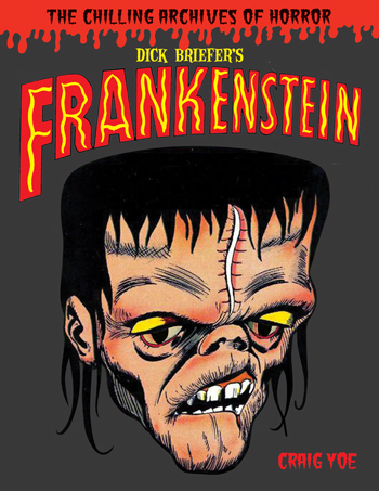
  • True to his love of vintage comics creators who embrace both the bizarre and the bawdy, Yoe‘s 2010 Halloween seasonal release this month offers a definitive collection of the one Pre-Code horror comic that schizophrenically shifted between the hilarious and the horrific: Dick Briefer’s Frankenstein!

    As Yoe details in this new volume’s excellent (and heavily illustrated) introduction, Briefer (1915-1980) attended classes in the late 1930s under Robert Brackman at New York City’s famed Art Students League before starting his comicbook career laboring in the Will Eisner/Jerry Iger sweatshop. Among Briefer’s earliest creations were an adaptation of Victor Hugo’s The Hunchback of Notre Dame (for Jumbo Comics; Yoe offers a reproduction of the first installment’s splash page), space heroes Rex Dexter (for Mystery Men Comics) and Crash Parker (Planet Comics), “The Pirate Prince” (for Silver Streak and Daredevil), Yankee Longago (Boy Comics), Biff Bannon (Speed Comics), and superheroes like Dynamo, Real American #1 (yep, that was his name!), Target and the Targeteers, and the Human Top, among others.

    Like many Golden Age creators, Briefer was incredibly prolific (at the meager page rates available, the only way to keep a roof overhead and food on the table was to grind out pages as quickly as possible) and worked under a variety of nom de plumes as well as his own name. Among the pseudonymous strips some comics scholars attribute to Briefer were the adventures of Communist hero Pinky Rankin for The Daily Worker (a stint that may or may not have been Briefer’s work, and may or may not have landed Briefer on McCarthy era blacklists).

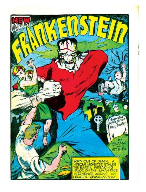
    Briefer‘s claim to fame, however, was and remains his innovative horror comic series “The New Adventures of Frankenstein,” which debuted in Prize Comics #7 (cover dated December 1940, meaning it hit the racks in the fall of that year). Briefer did everything—script, lettering, pencils, inks—on this new feature for the Crestwood Publishing Company (aka Feature Publication and Prize Comics), which may have been the first contemporary spin on Mary Shelley‘s venerable 1818 source novel.

    The catalyst for Briefer’s resurrection of Shelley’s immortal monster was arguably the 1939 Universal Pictures re-release of the two feature films that launched their beloved 1930s horror cycle, Tod Browning‘s Dracula (1930) and James Whale‘s Frankenstein (1931). Universal had abandoned the genre by the mid-1930s, due in part to the loss of the entire British (and British colonies) market, where horror films were proving less and less marketable since the British censors had instituted the dreaded ‘H’ certificate. By the end of the decade, Universal’s fortunes had dwindled, and the surprise success of a regional “midnight movie” showing of the Dracula/Frankenstein double-feature prompted Universal to roll the double-bill out nationally and to rekindle their horror line with the production of an all-new Frankenstein entry, Rowland V. Lee‘s Son of Frankenstein (1939). It was a smash hit, saving Universal’s fortunes and kicking off a whole new horror movie cycle that lasted into the mid-1940s (ending with Universal’s parody Abbott & Costello Meet Frankenstein, 1948).

  • National Periodicals (aka DC Comics) featured an unusual photo roman (aka photo fumetti) adaptation of Son of Frankenstein in the debut issue of Movie Comics that same year (for more, and to read the complete eight-page “Son of Frankenstein” comic story, click this link for the first of four installments at Myrant).
  • Whether Briefer was directly or indirectly inspired to launch his own Frankenstein comic series by the revival of the Universal monster movie series and/or the Movie Comics adaptation, who can say? The fact is, those were the most direct precursors to Briefer’s series, which took the public’s conflation of the creator (Frankenstein) and his monster (Frankenstein’s monster) as a given—the monster was Frankenstein in name—and ran with it. Briefer took the public’s identification of the monster with its creator one step further, signing the original installments “by Frank N. Stein.”

    “I had a hard time convincing the publisher that [Shelley’s Frankenstein] was in public domain,” Briefer told interviewer Howard Leroy Davis, but it was, and Briefer thrust the monster into a new life with Prize Comics #7’s revisionist take on the monster’s birth. Beginning as an apparent Gothic, Briefer depicted Dr. Victor Frankenstein’s construction of the monster from “the dead bodies of scores of men” in an efficient single page; by page three, the monster was on the loose, and by page five (“one fine day at the zoo…”), 1939 readers were begin to fathom that this resurrection had somehow taken place in then-modern-day America! Briefer had his monster escaping the zoo on an elephant, terrorizing the Big Apple, climbing the Statue of Liberty and sparing the life of his creator as an act of revenge:

    “I spared you to live—to live in misery also—to watch and see the suffering and grief that I, your creation, will cause the human race!”

    And so it began! Briefer’s original series was indeed a straight horror-adventure comic, the first of its kind in American comics history (seven to eight years before the first horror anthology comics surfaced with Avon’s 1947 one-shot Eerie #1 and American Comic Group’s long-lasting periodical Adventures Into the Unknown, which debuted in 1948). Craig Yoe offers the first three installments of Briefer’s initial series (pp. 21-44 of the collection)—which includes the monster’s one-on-one urban battle with a crocodile man—whetting one’s appetite for a complete reprint collection of the entire Briefer original series.

    Briefer’s revamp of the monster’s design emulated some aspects of Universal makeup genius Jack Pierce‘s original ‘look’ for actor Boris Karloff‘s movie incarnation of the monster: the squared-off skull, the ragged sutures across the forehead, the cadaverous pallor and sunken cheeks. But Briefer skirted any legal claims Universal might have made by traumatically rearranging the monster’s facial features, squashing the flattened nose directly beneath the knobby brows and between the outsized eyes, and dispensing with the electrode (“bolts”) protruding from the neck. Briefer’s monster was indeed hideous, and Briefer cranked out a tsunami of terror tales featuring the creature through to the April 1945 issue of Prize Comics #52 and the launch of Frankenstein in his own title that same year.

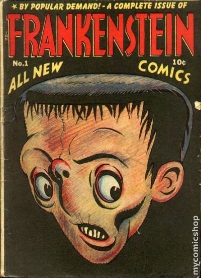
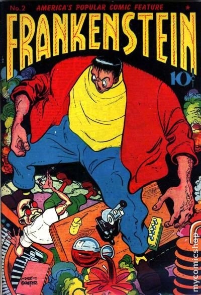
    Prize Comics #53’s “Frankenstein and the Beanstalk” was the last of the fantasy-horror Briefer Frankensteins; with a new original story in Frankenstein #1 (“Frankenstein’s Creation,” reprinted complete in the Yoe collection, pp. 45-59) and Prize Comics #53’s “Pour Out Your Heart,” Briefer redirected his ongoing feature, transforming it into an adsurdist kid-friendly horror-comedy comic!

    By this point, Briefer’s distinctively fluid brushwork had become absolutely breezy and more expressive than ever, and the complete change in tempo, temper, and tone suited his brushline. It was a new lease on life for Briefer and his beloved monster, whose nose slid progressively further up into his browline within the pages of Frankenstein #1 alone (as demonstrated in this collection’s generous reprint of no less than three stories from that historic first issue)!

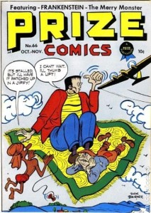
    By 1947, Briefer was writing and drawing Frankenstein (now labeled “The Merry Monster”) for Prize Comics and for the character’s solo series (!). Editor Yoe offers two other Briefer comedic Frankenstein stories from this period, “Blooperman” (from Frankenstein #8, July-August 1947), included herein due to its pointed satire on the most popular four-color superhero of them all (and in case you’ve any doubt, Briefer’s satiric byline for the story, “by Seagull & Shoestring,” puts paid to that), and the beguiling Spirit parody “The Girl with the Bewitching Eyes” (from Frankenstein #15, September-October 1948). Well, I’d tag it as an Eisner parody, if only for its femme fatale, Zona, but the whole of Briefer’s approach to this one Frankenstein tale smacks of Eisner’s iconic 1940s body of work.

    Briefer’s Frankenstein shifted gears again with the hardcore horror comics boom of the early 1950s, and Yoe offers a quartet of Frankenstein tales from Briefer’s return to horror amid the Pre-Code horror swamp. “Tomb of the Living Dead” (Frankenstein #20, August-September 1952), “Friendly Enemies!” (from #24, April-May 1953), “The She-Monster” (#28, January 1954) and “The Tree of Death” (#31, June-July 1954) are indeed representative of the swansong years of Briefer’s series. These aren’t the stories I’d have selected from this period in Briefer’s horror series (there are better ones, to my mind), but they’re interesting enough horror tales, sparked with inventive imagery and bits of business. Sadly, they lack the energy of Briefer’s earlier stories. Even the brushwork denotes his exhaustion with the 14-year-run, though ever the pro, Briefer doesn’t short-shrift the reader: the storytelling is crisp, clear, and the narratives provide enough twists to keep even the most jaded genre reader’s interest.

    With Dick Briefer’s Frankenstein, archivist/editor/packager Craig Yoe continues to provide a service to the comics community. While this tome is as stylishly produced as all Yoe’s books—if anything, the cool die cutting of Frankenstein’s eyes lends this volume an appropriately children’s storybook flavor—Yoe has finally addressed the one complaint I have with too many of such compilations: Craig cites the original publication source, date, and year of publication on the first page of every story. Kudos, Craig, and here’s hoping this practice becomes standard operating procedure for all future collections.

    Per usual, the color reproduction from the original comics retains the flavor of the Pre-Code four-color showcases, and the restoration work on the stories themselves is exquisite. While the Briefer Frankenstein comic stories have periodically been reprinted in the years since Briefer’s death—including reprints in Dr. Frankenstein’s House of 3D (1992), the Cracked monster magazines Cracked Monster Party (1988) and Monsters Attack! (1989-90), and a recent black-and-white paperback reprint volume entitled The Monster of Frankenstein (2006)—this current collection eclipses them all handily, while offering the most comprehensive overview of Briefer’s life, work, and the arc of the Frankenstein comics stories Briefer single-handedly created.

    Yoe spices the stew with a generous helping of Briefer artwork from his other Frankenstein efforts, including his ill-fated comic strip proposal(s), stages of work (roughs, pencils, inks) preserved from Briefer’s process, and an eye-popping array of cover reconstructions Briefer painted and drew for fans later in his life.

    Dick Briefer’s Frankenstein is the ideal Halloween/Christmas gift for any monster-lovin’ comics reader, and establishes a welcome new threshold for the entire Yoe/IDW line of reprint volumes. This is highly recommended reading, and as with all the Yoe collections, a grand entertainment from cover to cover.

    – Stephen R. Bissette, Mountains of Madness, VT

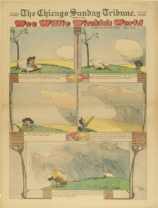
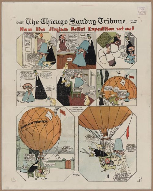
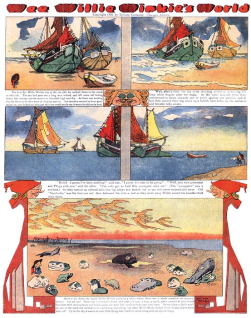
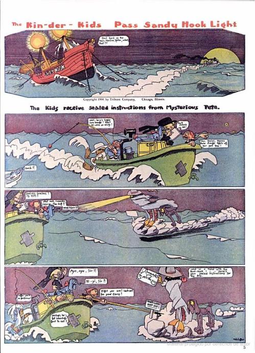
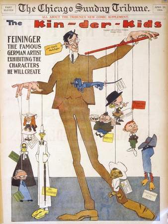
    Survey 1 Comic Strip Essays: Andy Warner on Lyonel Feininger’s “The Kin-Der-Kids” & “Wee Willie Winkie’s World”

    Note: This is the second in a series of essays written by the current Class of 2012 for Survey of the Drawn Story I, CCS’s comics history class. They are posted here in approximate chronological order of when their chosen subjects—comic strips—were either first published, or in their heyday.

    These were class assignments, and should be enjoyed in that context; these are not necessarily indicative of the work the individual artists/writers would do in paid professional venues. This is work assigned in class with a tight deadline, completed while juggling many other class assignments. That said, it is all of high caliber, or we would not be sharing it with you here. Enjoy!

    Unless otherwise noted, any image captions or comments in brackets [like this] were added by the Survey I instructor, Stephen Bissette, to enhance this public post, as were the author info and “further reading” notes after the essay and author’s footnotes. All illustrations in this particular post were added by the instructor.

    ________________________________________________

    Lyonel Feininger: Lost Expressionist Master of the Sunday Comics Page
    by Andy Warner
    (CCS, Class of 2012)

    The brightest stars shine briefest. The light of Lyonel Feininger’s brilliant comics may have winked out due to a contractual dispute, but still now, over a century after they were produced, they seem too wonderful, too weird, to have existed even for the single year he was active in the medium. Although Feininger made a name for himself in painting and printmaking (he designed the cover for the Bauhaus 1919 manifesto, was associated with several expressionist groups in Germany, and even had the distinction of being labeled “degenerate artist” by the Third Reich), the tall, gangly German-American artist’s cartoon output was limited to two strips he created in 1906 for The Chicago Sunday Tribune: The Kin-Der-Kids and Wee Willie Winkie’s World. Even a cursory glance at these large-format Sunday pages is a visceral experience. Feininger was making comics like no one else in his era. Before Egon Schiele met Gustav Klimt, just as Picasso and Braque were developing what would become cubism, Feininger’s comics exploded in glorious color from the pages of the Tribune. His figures move at odd angles, all limbs, hands and caricatured faces. The environment, while expressly the focus of Wee Willie’s World has an incredible vitality in both strips. Waves crash and smash, lightning tears jagged lines through the sky, clouds loom impossibly large and city alleyways tilt insanely. In no small feat, the worlds that Feininger creates make Windsor McCay’s Little Nemo dreamscapes seem almost static by comparison.

    The Kin-Der-Kids is the more developed of the two strips. Like other comics of the era, it begins with an introduction to the cast of characters. Right off the bat, Feininger impresses upon his readers that this will be no ordinary cartoon. As could be expected by the title, the action revolves around the adventures of the three Kin-Der brothers, Daniel Webster, Pie-Mouth, and Strenuous Teddy. The character designs revel in their own weirdness. Daniel Webster, ostensibly the leader of the group and thus the focus of the readers’ sympathies, is a pale to the point of jaundiced, prematurely balding bookworm with a vast forehead, deeply creased with worry lines. He is dressed in funereal black and throughout the course of the strip, rarely removes his nose from whatever book he can find. Pie-Mouth is a grotesquely fat child blessed with a perpetually gaping maw that he stuffs constantly with whatever grub he can lay his greedy hands on. Strenuous Teddy is a preternaturally strong redhead who can usually be relied upon to get the Kids out of a tight spot. The supporting characters are no less strange. Daniel Webster’s dog, Sherlock Bones, is a gaunt little blue Dachshund with all the sadness of the world in his eyes. Rounding out the crew is Little Japansky, a clockwork water baby found at the bottom of the ocean. A technological marvel presumed lost by a marauding Japanese submarine, he’s the tireless mechanical workhorse that powers the leaky bathtub the Kin-Der-Kids go adventuring in. Their nemesis is Aunt Jim-Jam, a severely attired matron who’s not above engaging in a footrace through the streets of London in order to administer the boys their hated dose of castor oil. Unrelenting as a hell hound, she’s accompanied in this quest by the ludicrously dressed Cousin Gussie, and a disturbingly featured, small yellow man with thinning hair named Buggins. Last, but certainly not least bizarre, is Mysterious Pete, a supernatural being of unexplained origin clad in chaps and a cowboy had who rides around on a cloud with his trusty hound and guns down waterspouts with a six-shooter.

    After this brief introduction, The Kin-Der-Kids begins in media res with the boys already sailing past Ellis Island in a bathtub. How did they get there? Where did Japansky come from? Where are they even going, and why in a bath tub? Nothing is explained. In the second strip, Mysterious Pete shows up with instructions for their “trip,” but the reader is not privy to them. By the third strip, the Kids are harpooning whales. Feininger seems wholly uninterested in giving his readers any kind of grounding whatsoever. This works to the advantage of the strip, giving the unfolding action a crazed, madcap intensity right from the get-go. Feininger took advantage of the week-to-week format of the newspaper strip to work in a fashion that was still unusual at the time, a sustained serial narrative. The Kids brave a storm, Pie-Mouth’s eating binges and an enormous fish before the action shifts to Mysterious Pete alerting Aunt Jim-Jam to their whereabouts. Castor oil in tow, Aunt Jim-Jam and Cousin Gussie borrow a hot air balloon and the hunt is on. The rest of the strip’s brief run consists of the Kids escaping first to England, and then to Russia. The three have a spate of encounters with the locals in each country. They play rugby, race submarines and have competitions of strength with the British. In Russia, they’re taken captive by bomb wielding troops who, still stung by the Russo-Japanese war the previous year, believe Japansky to be a spy. Without fail, Aunt Jim-Jam, traveling by balloon, boat or insane flying machine, eventually shows up to terrorize the boys. After a final gag involving Pie-Mouth getting a sore tooth, the strip ends as abruptly as it began. The Kids are mid-adventure, stranded in Russia with Aunt Jim-Jam’s arrival imminent. No explanation is given for termination, and no denouement allowed.

    Wee Willie Winkie’s World, Feininger’s second strip for The Chicago Tribune, is no less strange. Bearing an obvious debt to McCay’s Little Nemo, the strip follows the titular character, a young boy, through a strange world of imagination. Unlike Nemo, however, Wee Willie Winkie expressly takes place in the real world (although on two occasions it recounts the protagonist’s dreams). The magical and strange environment, around which the whole of the action and story revolves, is entirely a product of Willie Winkie’s daydreams and confused perception. Everything surrounding him is anthropomorphized. Trees swaying in the wind become dancers; stone houses acquire character, wants and needs. Occasionally the fantasy is broken, Willie Winkie nears an object he thought to be an elephant and sees it to be only a tree trunk, but just as often, his vision of the world is presented as fact. Thunder clouds are massive giants the size of the sky, striding across the countryside. Water pumps are sleepy old gentlemen, sputtering gouts of liquid when their ponytails are pulled.

    While the art style of Wee Willie Winkie’s World is quite similar to that of The Kin-Der-Kids, the format could not be more different. The hallmark feverish action of The Kin-Der-Kids is replaced by a calm meditative pace, following Willie Winkie as he sleepily contemplates his surroundings. The story in The Kin-Der-Kids is told exclusively through dialogue and visual action, and the strip is marked by a complete lack of third person narration. Wee Willie Winkie’s World, by contrast, is composed entirely of it. Indeed, the prose is separated entirely from the art, and set below the panel frames. This gives the impression of a children’s book, a mood Feininger further reinforces by using type, rather than the hand drawn text of The Kin-Der-Kids. There is no real story to speak of in Wee Willie Winkie’s World. The only thread of narrative that exists is spent on following Willie Winkie as he ambles through his world. The focus is squarely on the environment.

    In terms of character design, Willie Winkie bears some superficial resemblance to Daniel Webster. He possesses an unusually furrowed brow and is clad in a similar outfit. The black of Daniel Webster’s clothes, however, is replaced by a childish blue and Willie Winkie’s features are open and engaged. Where Daniel Webster is always facing inwards and down, forever lost in his books, Willie Winkie is only interested in the world around him. Aside from Willie Winkie, the only other real character in Wee Willie Winkie’s World is Feininger himself. The reader is meant to interpret the narration as a story, originally told to Feininger by Willie Winkie, retold to them through the comic. He appears only once in the strip, almost hidden in the corner of a panel, having accompanied his creation on a trip to an outcropping of seaside cliffs. He is a tall, thin figure, dwarfing Willie Winkie’s small frame as he sketches a panorama the boy points out to him.

    Wee Willie Winkie’s World, above all, demonstrates the total mastery Feininger possessed in the art of caricature. The artist had spent the 17 years previous working as an increasingly celebrated caricaturist for German and American magazines, including Harper’s Round Table, Humoristische Blätter, and Ulk. In Wee Willie Winkie’s World, this skill is used to great effect. An astonishing variety of faces burst from every possible place, from dour locomotives to shivering and nervous poplar trees. Other stylistic influences abound. Wee Willie Winkie’s World is structured along symmetrical grids, with big soaring panels. In their gutters, most frequently to break up the narration along the bottom, but also occasionally between the panels themselves, Feininger inserts beautiful and bizarre ornamentations. These take the form of trees, leaves, medusa-like heads, grinning jesters and heavenly bodies. Their place in the composition of the page is obviously influenced by Art Nouveau, but Feininger replaces the flowing curves of that style with his trademark chunky angles and geometric forms. A red eyed mouse frolicking in the gutter of a strip otherwise concerned with Willie Winkie’s take on a windmill is strongly reminiscent of Japanese woodblock prints. In one strip, the ornamentations even bear a striking resemblance to Mondrian and De Stijl. As that movement had yet to be born, however, it can be assumed that these exercises in color and line are Feininger’s own experimentations.

    Although he’d worked in illustration and caricature for years, Feininger came to comics through a chance opportunity, and left them much the same way. He was born in 1871 in New York City to German speaking parents. He possessed a childhood fascination for steamboats and locomotives that would leave its mark on both his comics and fine art, and showed an early aptitude for drawing. While he wouldn’t create comics until the age of 35, he was influenced in his childhood by American cartoonists and the margins of the letters he wrote as a young man to his friend and fellow artist, Alfred Vance Churchill are filled with expressive and expertly rendered cartoon sketches. Feininger left America for Germany in 1888 to attend art school, and adopted the land of his parents as his own. For the next decade and a half, he sold caricatures to humor magazines, often chafing against the demands of his editors.

    Meanwhile, back in America, newspaper comics were experiencing a golden age. In 1905, when Windsor McCay was tapped to demonstrate the artistic potential of Sunday comics with Little Nemo in the pages of The New York Herald, other newspapers took note. Amongst them was James Keeley, editor of The Chicago Tribune. Deciding not to be outdone and wanting to appeal to Chicago’s large German population, Keeley traveled to Berlin in February of 1906 to procure the services of a bevy of German cartoonists for his full color Sunday pages. Feininger met Keeley, and, seduced by the promise of a steady income of 24,000 marks for his services, agreed to produce the two weekly strips for the Tribune. Problems began almost immediately. The vibrancy and joy of the Kin-Der-Kids and Wee Willie Winkie’s World disguised a troubled relationship between Feininger and the editorial staff. The Tribune had wanted a strip to compete with the Katzenjammer Kids’ repetitive joke-a-week format, but The Kin-Der-Kids’ fever dream of a sustained narrative immediately derailed their plans. Circulation dropped, the cartoonists were blamed and The Kin-Der-Kids was axed, with Wee Willie Winkie’s World replacing it. This did little to staunch the bleeding, and by winter of that year, Feininger was gone from the pages of the Chicago Tribune, and gone from comics forever. The exact circumstances surrounding his departure remain somewhat mysterious. Some sources cite a personal dispute between Feininger and the Tribune’s editors, others point to the burden of producing detailed weeklies as proving too much for the artist, while others place the blame on Feininger’s unwillingness to move back to America. Regardless of the details of his dismissal, Feininger’s greatest fame lay ahead of him. Although he achieved his highest heights in other artistic mediums, it is truly a pity that his comic output is so small. In the single year he was active, he established a more unique style and world than those that many cartoonists spend lifetimes creating.

    Sources:
    Thompson, Kim. The Comic Strip Art of Lyonel Feininger. Seattle, WA: Fantagraphics, 2007.

    “Lyonel Feininger.” Oregon State University Cartoon Library & Museum Website. 6 Oct. 2010

    Markstein, Don. “Lyonel Feininger.” Don Markstein’s Toonopedia. 6 Oct. 2010

    “Alfred Vance Churchill Papers Regarding Lyonel Feininger, 1888-1944.” Smithsonian Archives of American Art. 6 Oct. 2010.

    “Lyonel Feininger on Artnet.” artnet. 6 Oct. 2010

    [The above essay is ©2010 Andy Warner, all rights reserved; it is posted with permission.]

    ________________________________________

    About the author/student:

  • Andy Warner has a few online outposts. Here is his website;
  • here is a sampler of Andy’s comics work;
  • and here is Andy’s blog. Give them all a look-see.

  • Further reading & resources:

  • The Lyonel Feininger Digital Album is highly recommended, comprised of images from the San Francisco Academy of Comic Art Collection, which was acquired by The Ohio State University Cartoon Research Library from Bill Blackbeard in 1997. Click this link!

  • You can purchase your own copy of The Comic Strip Art of Lyonel Feininger: The Kin-Der-Kids and Wee Willie Winkie’s World at amazon.com; here’s the current availability.

  • Survey 1 Comic Strip Essays: Katie Moody on Winsor McCay’s “Dream of the Rarebit Fiend”

    Note: This is the first in a series of essays written by the current Class of 2012 for Survey of the Drawn Story I, CCS’s comics history class. They are posted here in approximate chronological order of when their chosen subjects—comic strips—were either first published, or in their heyday.

    These were class assignments, and should be enjoyed in that context; these are not necessarily indicative of the work the individual artists/writers would do in paid professional venues. This is work assigned in class with a tight deadline, completed while juggling many other class assignments. That said, it is all of high caliber, or we would not be sharing it with you here. Enjoy!

    Unless otherwise noted, any image captions or comments in brackets [like this] were added by the Survey I instructor, Stephen Bissette, to enhance this public post, as were the author info and “further reading” notes after the essay and author’s footnotes. All illustrations in this particular post were added by the instructor.

    [Winsor McCay, Dream of the Rarebit Fiend: This March 8, 1905 installment of Rarebit Fiend inspired McCay’s 1921 animated film The Pet, the first-ever ‘giant monster attacking a city’ motion picture ever made. Thus, McCay and Dream of the Rarebit Fiend was arguably the wellspring for immortals like King Kong and Godzilla!]

    ________________________________________________

    Strip Analysis: Winsor McCay’s Dreams of the Rarebit Fiend
    by Katie Moody
    (CCS, Class of 2012)

    The first sixty strips of Dream of the Rarebit Fiend, as collected by Frederick A. Stokes in 1905 and recollected by Dover Publications in 1973 [cover pictured at left], are a hallucinatory window into the 1905 adult’s subconscious. As a pioneer of the nascent storytelling medium that modern readers would recognize as comics, Winsor McCay in particular represents a bridge between static, classic illustration and the more flexible, faster-paced nature of comics storytelling, a change itself enabled by advances in printing technology. His sophisticated themes, visual tropes, and other stylistic bids for sequential art’s legitimacy—all readily apparent in this mere seven percent of the strip’s run—remain relevant to comics enthusiasts today.

    Following at least ten earlier newspaper strips from McCay—with his more lighthearted Little Sammy Sneeze and Hungry Henrietta among them—Dream of the Rarebit Fiend stands out as a series of grand experiments. Its target audience is adult readers; the laws of reality and reason apply only to the final panel, the themes are more mature, the protagonist (almost always an adult) changes with each installment, and the entire blossoming field of psychoanalysis (Freud’s seminal* Interpretation of Dreams was published only five years prior) is McCay’s playground. Deep-rooted desires, primal fears, and social anxieties—the latter represented by dreamt inept encounters with peers who deliver, with straight matter-of-factness, what readers would immediately recognize as gleeful absurdities—frequently imperil the rarebit-fueled sleeper, and these fever-dream themes are so universal and relatable that many of the scenarios, metaphors, and visuals are still compelling over a century later.

    McCay’s accomplished Dream illustrations—with his characteristic strict perspective, lush detail, and trendy Art Nouveau influences in line weights—are obvious attempts to appeal to turn-of-the-century sensibilities. McCay was a woodcut illustrator first, and so upon switching professional gears to creating newspaper strips he must have been well aware of engaging in a popular art form—almost by definition ubiquitous, embraced by the public, and dismissed by critics. While he was pragmatic enough to find such profitable venues for his creative experiments as print and (especially with his animation milestone Gertie the Dinosaur) vaudeville, the work itself has a level of craft and technical integrity that is inarguable to modern eyes.

    Now that McCay’s later strip Little Nemo in Slumberland is universally recognized as an early comics masterpiece, and Dream of the Rarebit Fiend is an obvious precursor to Nemo in both subject and content, it is clear that McCay took the entire rarebit endeavor seriously in spite of all the wild experimentation. Even the angles and placement of the dialogue text are toyed with, as seen in strips forty-three to forty-five (on pages 45-47); A word balloon twists up along the wake of its tossed speaker [above, right], angry and indignant retorts swirl around the chaos of a physical altercation [left], and even the “OH OH OH OH” of a sideways-flattened commuter is placed on end [below]. The reading experience was McCay’s to toy with, manipulate, and consciously attempt to control; perhaps his testing and invention in the medium was further bolstered by the use of a pseudonym, “Silas” (employed for contract reasons).

    So why does this strip have such longevity and an immediacy that enchants new readers to this day?

    In spite of the 1905 collection’s claims to the contrary, Rarebit itself is unnecessary, as any other foodstuff could stand in for the arbitrary nightmare fuel if sufficiently spicy or exotic. In this strip, rarebit simply symbolizes excess and a source of regret; it is a seed that has a vivid and unsettling blossom of insight, though the shuddering dreamer rarely cares to give their experience further exploration. The modern equivalent of rarebit is another ubiquitous “cheese pie” that is often paired with beer—a combination still blamed for occasional agitating misadventures in dreamland.

    Since it’s not the specific source of the dreaming that has endured, it must be the dreaming itself. The few topical references of McCay’s time that made it into this collection’s strips—Roosevelt, the newly constructed Flatiron Building in New York, jabs at Mormons (whose church had only officially abandoned polygamy, the strip’s topic, in 1890)—are curious artifacts of its original time-specific context, but the episodic and continuity-free nature of each exuberant installment allow the strip to remain welcoming to new readers. The entertaining exaggerations and alarming scenarios, the fast and furious rush of strange plots and characters’ resonant emotional responses, and the operatic lushness of McCay’s panels all but beg further reading. Dream of the Rarebit Fiend is a page-turner if ever there was one, with more eventful developments in its eight to nine panels than in an entire issue of most modern “event” tie-in pamphlets.

    Given the fast-paced and effusive assault of content that McCay packed into each episode of Dream, the alacrity of this new medium must have been intoxicating to him. Far before Hollywood became the special-effects powerhouse that we (and Michael Bay) know so well today, Winsor McCay was using pen, paper, and gray matter to convey the most fantastical stories scenarios that he could conceive. Though he would later explore the logical conclusion between comics and film with his forays into early animation, his visual storytelling needed no more than the printed page itself in order to convey a compelling experience to his audience. That McCay’s chosen medium would still be struggling for serious legitimacy a century later, in spite of the mature themes and visual metaphors employed by him and countless other creators over the intervening years, is due to no fault of his own.

    Footnotes:
    * (Cough.)

    Source:
    Dreams of the Rarebit Fiend; McCay, Winsor. Dover Publications, Inc., New York, NY. 1973.

    [The above essay is ©2010 Katie Moody, all rights reserved; it is posted with permission.]

    [A page of Winsor McCay Rarebit Fiend original art, from the collection of Dr. Ulrich Merkl (see below).]
    ________________________________________

    About the author/student:

  • Katie Moody comes to CCS with professional credentials in the field, which you can see here;
  • at present, she does not offer an online blog or site for her work, but once she does, we’ll add that link.

    Further reading & resources:

    * CCS faculty member Stephen Bissette interviewed German art and comics scholar/archivist Ulrich Merkl about Dr. Merkl’s definitive Dream of the Rarebit Fiend collected edition, which we have in the Schulz Library rare books collection (donated by Bissette and Dr. Merkl).

  • Read “Dream of the Dream of the Rarebit Fiend: An Interview with Ulrich Merkl (with Three Addendums),” at the original Myrant blog site (archived at this link), July 23, 2007.
  • In his 2007 Myrant overview of the year’s best books, Bissette wrote:

    “Ulrich Merkl’s ravishing, absolutely definitive Dream of the Rarebit Fiend collection is jam-packed with much, much more than “just” the most complete collection of Winsor McCay’s seminal comic strip available anywhere on Earth. It’s also a comprehensive overview of McCay’s life, career and the context of the times in which one of our greatest cartoonists created this still-amazing strip, which essentially poured the foundation for the whole of 20th Century comics (and, as Merkl demonstrates, much of its art, cinema and visionary works).”

  • Joshua Glenn of The Boston Globe has archived this lively narrated online slideshow, based on Dr. Merkl’s book, demonstrating the influence of McCay’s work on many famous films (covered in further detail in Markl’s book, of course).